

The Photo: Color Theory
The Photo: Color Theory
Tuesday's Child Is Full of Grace

I had the privilege to audit two classes taught by colleagues in the Art Department some years ago. One was the introductory class, the other was live drawing.
I probably learned more about pedagogy than I did about producing visual art. Both the professors demonstrated a really elegant awareness of how to teach both prodigies and mediocrities (I’m in the latter camp) at the same time, and to guide them through productive interactions with each other.
But I did pick up a few things about composition and about the relationship between technique and individual style that I think stimulated my self-learning with photography.
One thing I didn’t get a chance to learn formally was color theory, the way that visual artists approach mixing colors and how colors interact. It used to be that my colleagues reserved that for the first painting class in their sequence, and much as I might like to audit that class (one of my favorite colleagues frequently teaches it), it’s always too popular—it doesn’t seem appropriate to audit a class that matriculated students always get lotteried out of.
This might be one reason I tend to favor black-and-white compositions in photography at times: not out of aesthetic confidence but out of fear of a colored planet. This is one reason I found Dina Litovsky’s critique of monochrome photography fairly compelling.

Though I like many of my B&W images and will likely continue to process some images in that way.

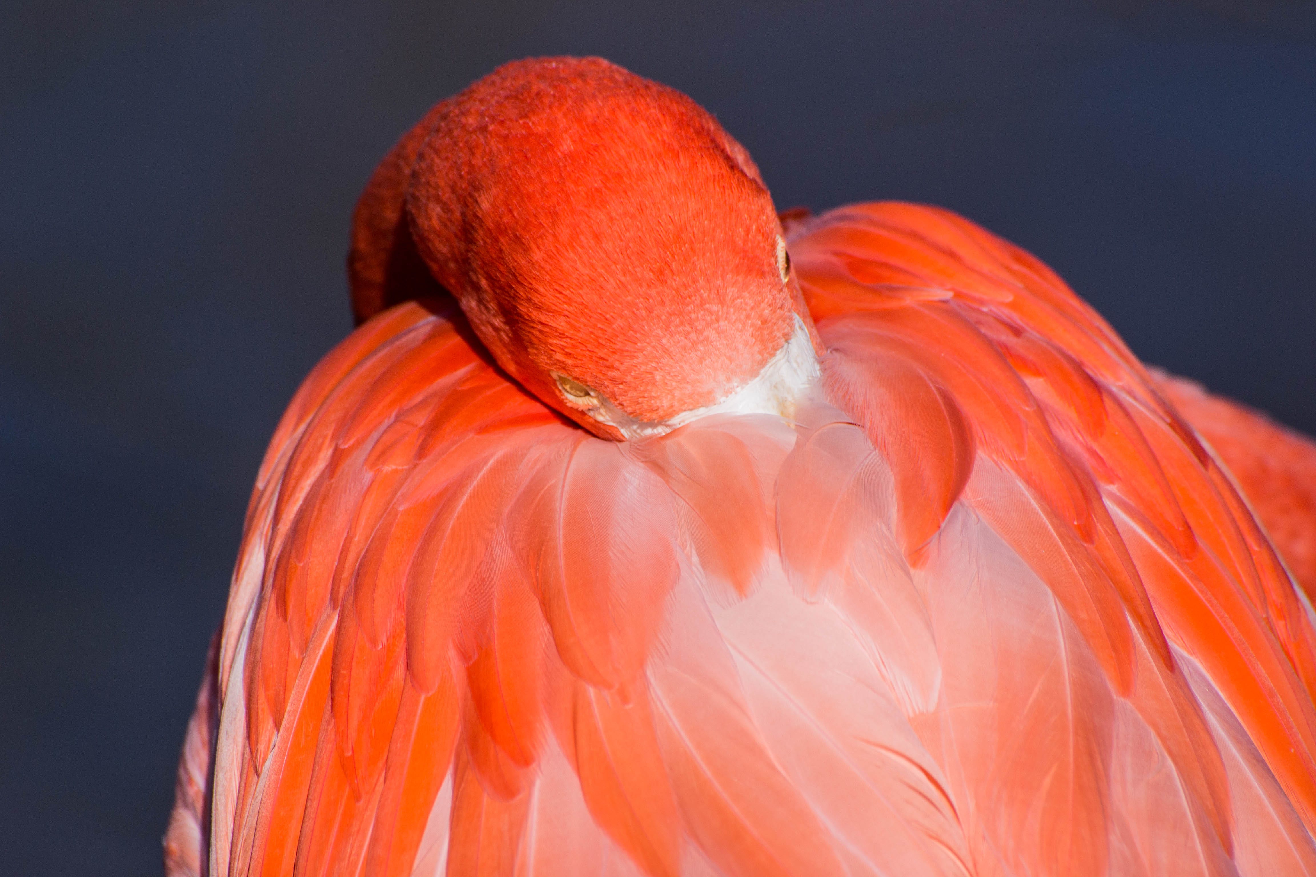
There are images like the one of the flamingo where color’s the only game in town, and yet where the garishness of the color makes me nervous. It’s completely real-life, not embellished; it’s the point of color for some animal species (though they’re not necessarily playing to human vision: some brightly colored plants and animals are being seen by other kinds of vision than what we possess, as I learned from Ed Yong’s book).
I know I’m happier when the color in an image is more subdued to begin with, or where I do some work through processing that gets me to that point.

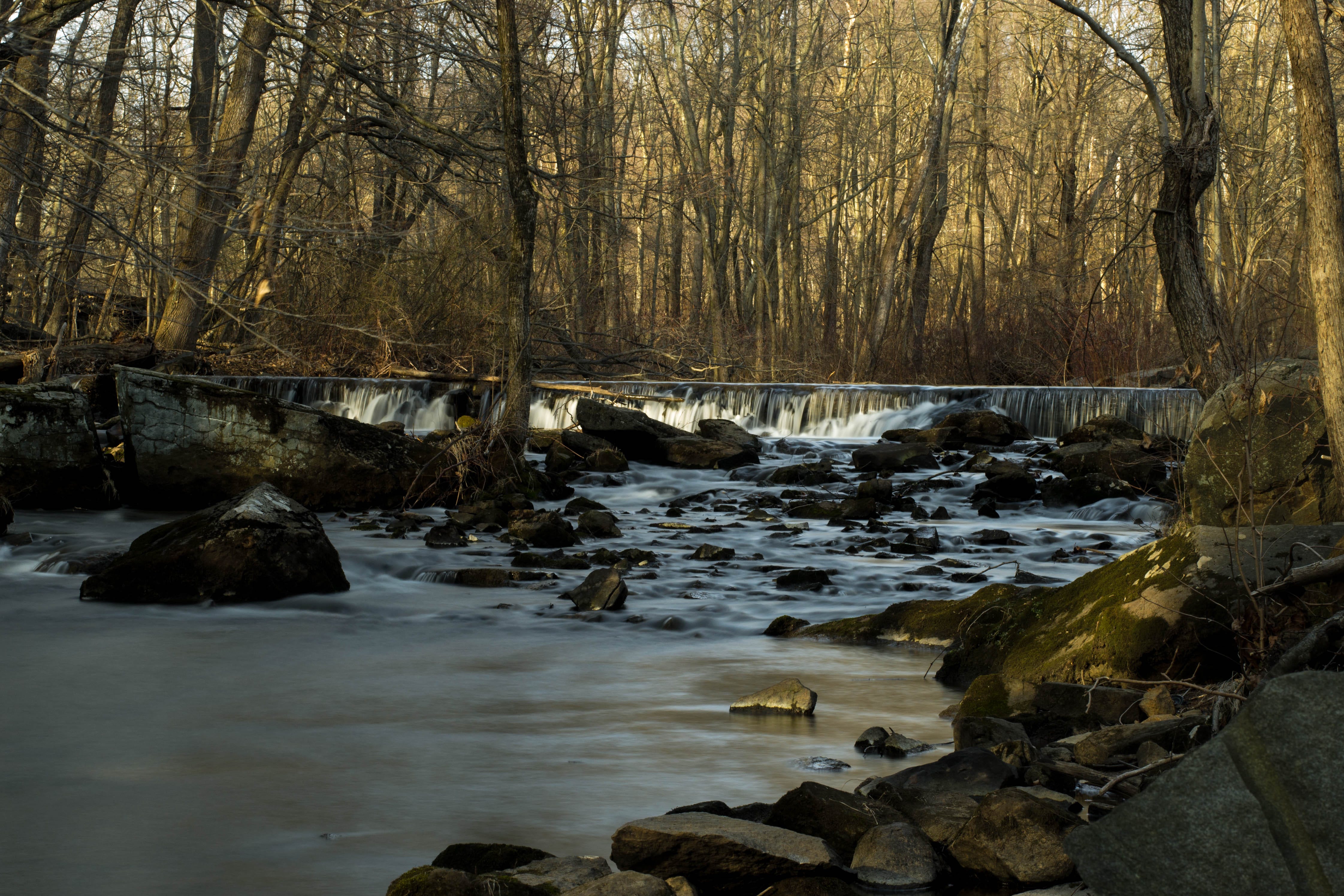
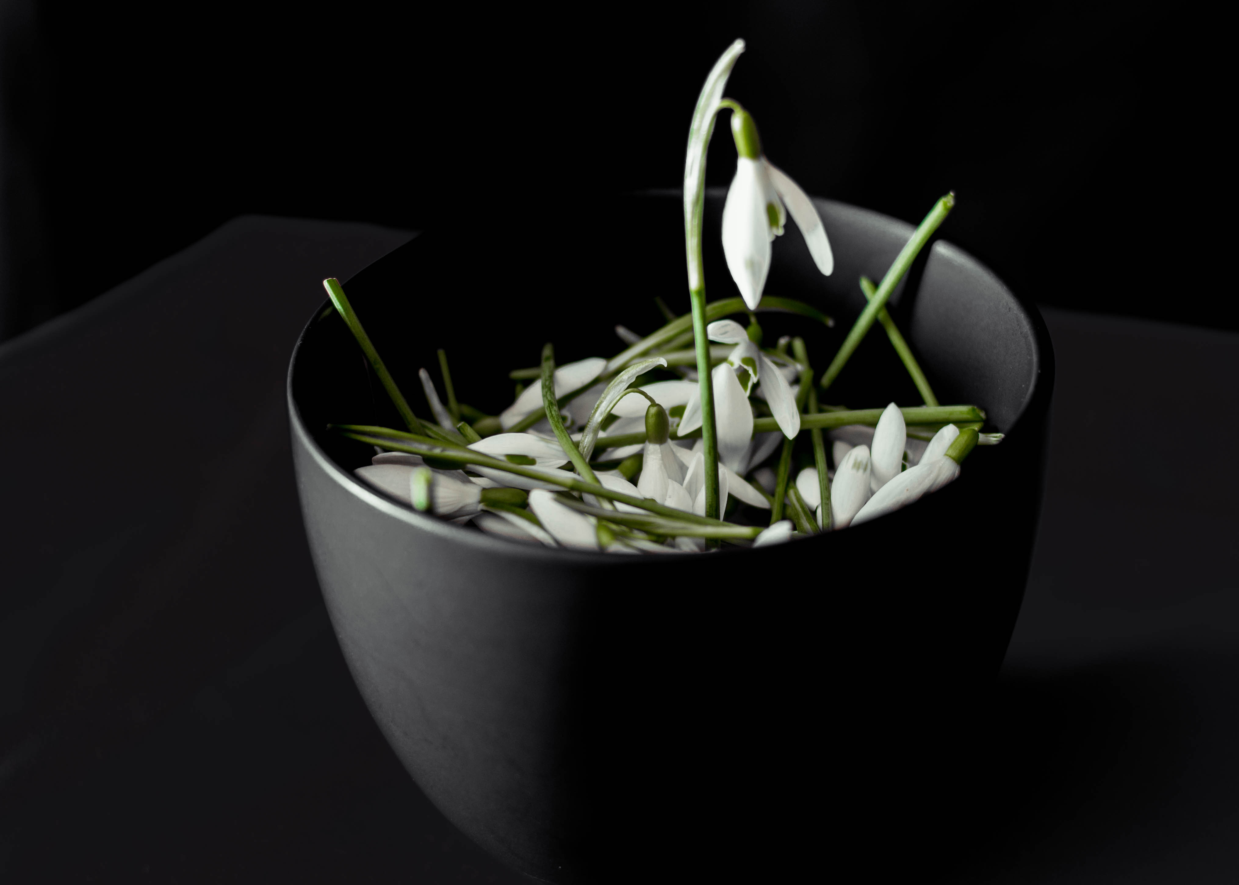
These are shots that I could imagine processing as monochrome but the color range and distribution seems to me to add a lot to the finished product without being the singular aesthetic of the photograph.
I might be happiest when there’s just one non-black or non-white color in the shot (without having to put it there via selective color in the processing, which is often a technique that I dislike and I associate with advertising).
Generally, this is another of those junctures where the more I think about it, the more uncomfortably aware I am of my auto-didactic acquisition of photography. I read so intensely along so many lines that I can’t help be aware of when I’m avoiding a kind of reading, in this case, art theory and technique writing focused on photography, perhaps because I fear finding out that my ideas about what I’m doing are just kind of embarrassing. (I can’t avoid it much longer simply because I’m actually working on a chapter of a manuscript focused on official photography in the early years of the Cold War in sub-Saharan Africa.)