

The Photo: Signs of the Times
timothyburke.substack.com
The Photo: Signs of the Times
Tuesday's Child Is Full of Grace

If I find the time and energy to go on a full-day photo prowl sometime soon, one of my favorite themes is commercial signage. It’s the one aspect of architectural photography that I’m comfortable with—you can make clear decisions on framing the shot in a way that either isolates the sign from the building or puts the sign in contact with the building or landscape around it. There are often opportunities to create funny juxtapositions or incidental commentaries, to make the words on the sign mean something more or less than their literal message. So many signs have a kind of beauty to them that we just shrug off, especially older signs—isolating them in a photo is a way to reinitialize what we see as we pass through a human-made world.


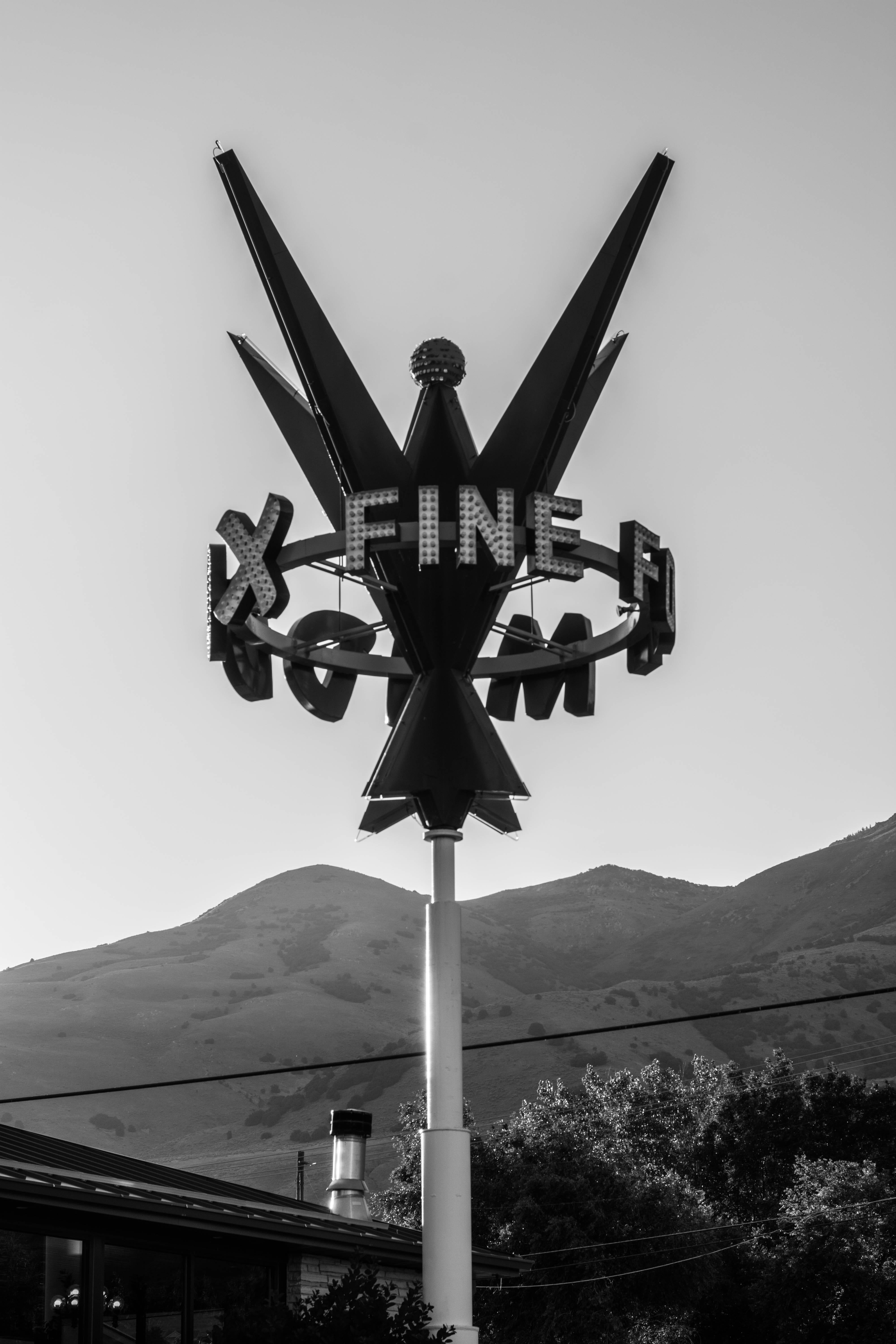


I do appreciate the gritty urban realism of those earlier signs. The artistic mix of typefaces (a sans with a script, and etc.). Nowadays, all seems flat and soulless.
Lower Broad Street would be a good place to take these kind of photos.